
吃豆豆动画效果
效果
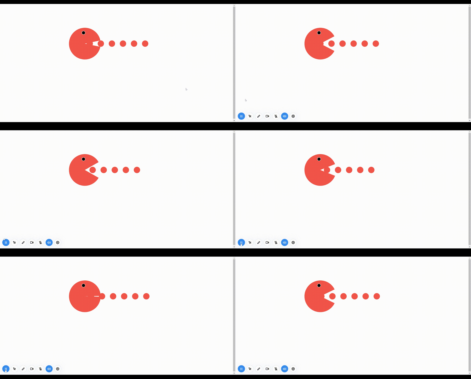
<!DOCTYPE html>
<html>
<head>
<meta charset="utf-8">
<title>吃豆豆动画效果</title>
<style type="text/css">
body {
margin: 0px;
padding: 0px;
}
.eat-peas {
width: 600px;
height: 200px;
/* background-color: antiquewhite; */
margin: 150px auto 0;
position: relative;
}
.eat-peas .head {
width: 200px;
height: 200px;
/* border: 2px solid blue; */
border-radius: 50%;
/* 隐藏多余盒子部分 */
overflow: hidden;
position: relative;
z-index: 2;
}
/* 利用伪元素构造盒子 */
.eat-peas .head::before {
content: "";
display: block;
width: 200px;
height: 100px;
background-color: tomato;
/* 以盒子底部中心为轴向上旋转盒子 */
transform-origin: bottom center;
transform: rotate(0deg);
/* 引入动画 */
animation: rotate1 .4s ease infinite alternate;
}
.eat-peas .head::after {
content: "";
display: block;
width: 200px;
height: 100px;
background-color: tomato;
/* 以盒子顶部中心为轴向下旋转盒子 */
transform-origin: top center;
transform: rotate(0deg);
/* 引入动画 */
animation: rotate2 .4s ease infinite alternate;
}
@keyframes rotate1 {
0% {
transform: rotate(0deg);
}
100% {
transform: rotate(-30deg);
}
}
@keyframes rotate2 {
0% {
transform: rotate(0deg);
}
100% {
transform: rotate(30deg);
}
}
/* 眼睛 */
.eat-peas .eye{
width: 20px;
height: 20px;
background-color: #000;
border: 2px solid #fff;
position: absolute;
top: 20px;
left: 80px;
border-radius: 50%;
}
/* 豆豆 */
.eat-peas .peas{
width: 40px;
height: 40px;
background-color: tomato;
border-radius: 50%;
position: absolute;
left: 120px;
top: 50%;
margin-top: -20px;
box-shadow: 70px 0px 0px tomato,140px 0px 0px tomato,210px 0px 0px tomato,280px 0px 0px tomato,350px 0px 0px tomato;
animation: move .8s ease infinite;
}
@keyframes move {
0%{
transform: translateX(0px);
}
100%{
transform: translateX(-70px);
}
}
</style>
</head>
<body>
<div class="eat-peas">
<div class="head">
<div class="eye"></div>
</div>
<div class="peas"></div>
</div>
</body>
</html>